
To create a new form you need to go to Backend -> JoomForms -> in Dashboard click on "New Form" button
Then set form title and name, you can start building the form fields in tab "Form builder", here details on about each tab:
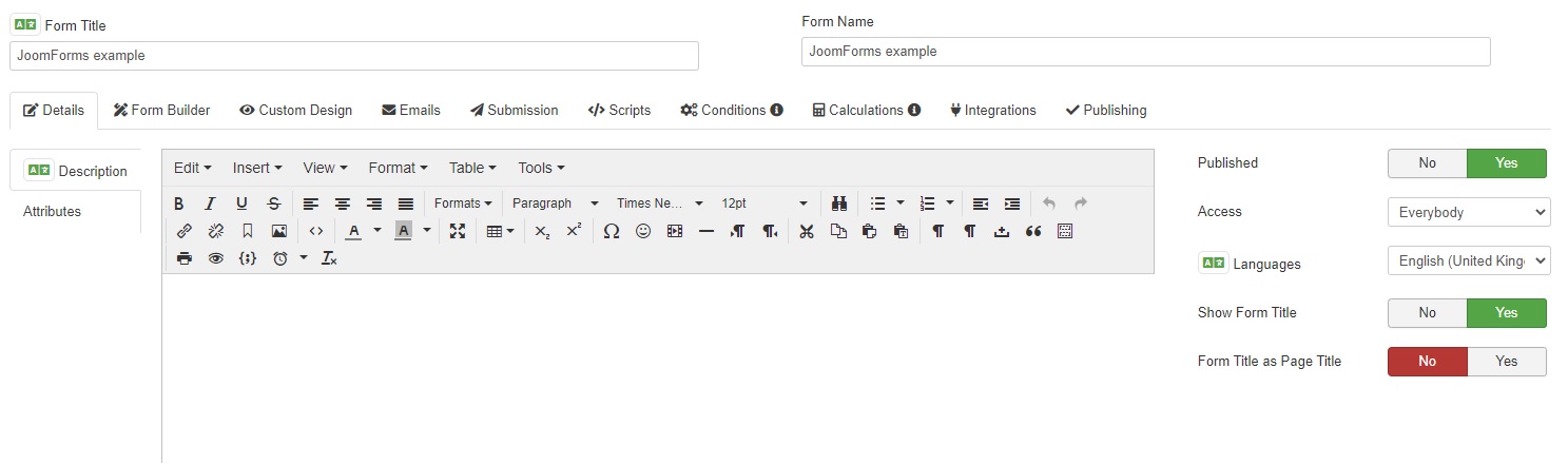
1 - Tab "Details"
This tab let you:
- Set form description (support Joomla default editor)
- Set/add form tag attributes like: action, name, id, class (read more about form tag attributes here: https://www.w3schools.com/tags/tag_form.asp#table1)
- Change form status, access view level and language
- Show / hide form title
2 - Tab "Form Builder"
This tab let you build your form easily by adding fields using drag and drop, create form rows and columns and configure each field instance.
Add and configure field
You can add field by clicking on it in left sidebar that display all fields, then a modal will open you can add field name and configure it
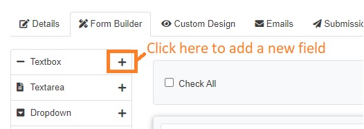
once you click on save will be added to the grid layout
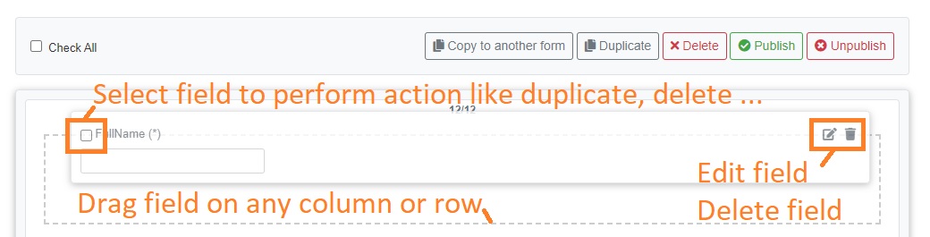
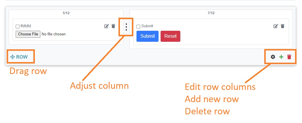
Grid Layout (Rows and columns builder)
Grid layout let you create rows and define how many columns on each row, also you will be able to change columns size and drag rows and fields.
3 - Tab "Custom Designs"
This tab let you customize form design and layout in depth
Subtab "Layout"
You can change frontend frameworks support (Bootstrap, UIKit ...), customize layout html structure or auto generated and more
Subtab "CSS"
Let you add your custom CSS code
4 - Tab "Emails"
In this tab you will be able to configure and customize emails to user and admin, also you can add some additional emails and customize email that will be sent once submissions is deleted.
Parameters
Email parameters that can be configured:
- Sender
- FROM Email: whenever the user receives the email, this will be the senders' address (i.e. from who the mail came from).
- From Name: whenever the user receives the email, this will be the senders' name (i.e. the person's name the mail came from).
- Recipient
- TO: the address where the email should be sent.
- Reply To Email: this is the email that will be used when the user uses the Reply option from his email account.
- Reply To Name: this text will be displayed within the header of the 'To' field when the user uses the Reply option from his email account.
- CC: the email address(es) you'd like to send carbon copies to.
- BCC: the email address(es) you'd like to send blank carbon copies to.
- Contents
- Subject: the subject of the email.
- Mode: you can send your email as plain text, or, if you wish to add more "color" to your message, you can send a HTML email.
- Message - Edit Text: the actual text of the email. If you set the last parameter (Email mode) to HTML, then you'll be able to put HTML code here for a nicer email look.
Important note! If you write HTML tags BUT haven't set the Email mode option to HTML, the HTML tags will not be interpreted and the user, instead of seeing a nice bold message, may see the actuall HTML code. Please take caution. - Message - Preview: here you can preview the email that will be sent to the user. This way you can see if the email message contains any HTML errors or if the email text was correctly written.
- Attachements (for user email only)
- Attach File: can be disabled or enabled
- Location of file: will be enabled to let you attach file if "Attach file" option is enabled
- PDF Attachements (for user and admin email only)
Placeholders
In all of these email types (admin, user, additional, deletion) . We defined for your ease of use general and form specific placeholders. Form specific placeholders are used just like layout placeholders are.
Field placeholders
Supported options for field placeholders are:
- value: this returns the value typed by the user in the corresponding component.
- name: the name of the component, as defined in the back-end.
- caption: the caption of the component, as defined in the back-end.
Example of use:
Suppose your form has a text field that requires the user to input his/her name. This component is called fullname. If you want to use that value in your user message, write this in your email text field: {fullname:value}
If an user typed "John Miller", the email that he would receive after he submitted the form will contain "John Miller" and not the placeholder.
General placeholders
This global placeholders can be used like this {global:placeholder_name}
| Placeholder name | Description | Logged in user required? |
|---|---|---|
| username | If the user is registered to your Joomla website, his username will appear when using this placeholder | Yes |
| userid | If the user is registered to your Joomla website, his user id will appear when using this placeholder | Yes |
| useremail | If the user is registered to your Joomla website, his email will appear when using this placeholder | Yes |
| fullname | If the user is registered to your Joomla website, his fullname will appear when using this placeholder | Yes |
| userip | The IP of the user that submitted the form | No |
| date_added | The date the user submitted the form | No |
| sitename | The name of your site, as defined in your Joomla configuration | No |
| siteurl | The URL of your site | No |
| confirmation | The URL used to confirm the submission | No |
| confirmed | The status of the submission | No |
| submissionid / submission_id | The id of the submission | No |
| mailfrom | The Global Configuration From Email address. | No |
| fromname | The Global Configuration From Name. | No |
| deletion | The Global placeholder that can be used in order to delete the submission. | No |
| language | Displays the language code a submission was made in. | No |
Example of use:
So, let's say that in the admin email you want to track the IP address of your submissions. Just add {global:userip} in your admin email message and every time you receive an email, the IP of the user that submitted the form will appear.
Control placeholders display
JoomForms allows you to control whether or not to display certain placeholder information(including the according description) by using an "IF" statement.
Example of use:
{if {name_of_field:value}}The submitted message is {name_of_field:value}.{/if}
>The string found within the {if} syntax will not show if the field has no value.
The {if} clause also accept the following operators:
<= , >=, <>, <, >, !=, =,==,===, <-, ->
- Assuming that you have a checkbox and you need to compare its value with a specific string, you will use:
{if {Checkbox:value}<-Item1}This text will be displayed if the Item1 value is selected, regardless of any other selections{/if} - If you want to display a text if the checkbox has only at least one of your desired values, you will use the following syntax:
{if {Checkbox:value}->Item1,Item2}This text will be displayed if one of the following values is selected: Item1 or Item2, or if both are selected. It will not display if another additional value is selected{/if} - If you want to see if the user entered a specific value into a field you can use the following syntax:
{if {field_name:value}=Your desired value} this text gets displayed only if the placeholder has the "Your desired value" value {/if}
Note the blank space between "if" and the field placeholder.